Divi 5 Design With Aspect Ratio Controls and Image Presets
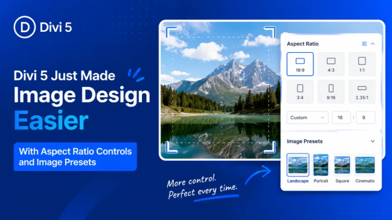
Table of Contents
If you’ve ever built a WordPress website, you already know how frustrating image management can become.
One image looks perfectly aligned, another stretches awkwardly, and a third suddenly breaks the mobile layout entirely. Things become even more complicated when clients upload images from different devices, suppliers, or stock libraries with completely inconsistent dimensions.
It’s a common problem that affects almost every type of website, from blogs and portfolios to WooCommerce stores and agency projects.
That’s exactly why the latest Divi 5 update feels so important.
With new Aspect Ratio controls, Image Framing, and reusable Image Presets, Divi 5 gives designers far more control over responsive image layouts directly inside the builder. Instead of relying heavily on Photoshop, custom CSS, or third-party plugins, many of these adjustments can now be handled visually within Divi itself.
For freelancers, agencies, content creators, and business owners, this update brings a cleaner workflow and a much more consistent design experience.
Why This Divi 5 Update Matters
Images are one of the most important elements of modern web design. They shape first impressions, improve storytelling, and help websites feel more professional and engaging.
But managing images consistently inside WordPress has always been surprisingly difficult.
Previously, creating polished image layouts often required:
- Manual image cropping
- Photoshop or Canva edits
- CSS aspect-ratio hacks
- Responsive media adjustments
- Extra plugins for layout consistency
That process not only consumed time but also created unnecessary friction during website development.
Divi 5 simplifies much of that workflow by introducing native controls that make image management easier and more predictable.
The result is:
- Cleaner layouts
- Faster design workflow
- Better responsive behavior
- More consistent visual presentation
- Less dependency on custom code
For many designers, this is one of the most practical Divi updates in recent years.
New Aspect Ratio Controls in Divi 5
The headline feature of this update is native Aspect Ratio support for image modules.
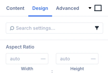 Aspect ratio defines the proportional relationship between an image’s width and height. Common formats include:
- 16:9 for wide sections and banners
- 1:1 for square image grids
- 4:3 for blog thumbnails
- 3:4 for portrait-oriented layouts
Until now, maintaining consistent image ratios often meant manually editing every image before upload.
Divi 5 changes that completely.
Designers can now define image ratios directly inside the builder, allowing images with different original dimensions to display within a clean and consistent structure.
This becomes especially valuable for:
- Blog archive pages
- Portfolio websites
- Team member sections
- WooCommerce product grids
- Gallery layouts
- Agency websites
Instead of fighting against inconsistent uploads, designers can now maintain visual balance much more easily.
A Common WordPress Problem: Why Do Images Always Look Inconsistent?
One of the biggest frustrations in WordPress design is dealing with images from multiple sources.
A client uploads a photo from their phone. Another image comes from a supplier. A third image is downloaded from a stock website. None of them share the same dimensions.
The result is usually:
- Uneven image grids
- Broken spacing
- Awkward mobile layouts
- Misaligned content sections
Even a professionally designed website can quickly lose its visual consistency because of mismatched image sizes.
Divi 5’s Aspect Ratio controls solve this problem by creating a structured image framework automatically. Instead of manually resizing every upload, designers can standardize how images appear throughout the website.
That small improvement can make an enormous difference in overall presentation quality.
Image Framing Adds Better Cropping Control
Another standout feature in this update is Image Framing.
Normally, when images are forced into fixed aspect ratios, important parts of the image can get cropped awkwardly. Faces may disappear, products become misaligned, or the subject loses its focal point entirely.
Divi 5 now allows users to reposition images inside their frames.
This gives designers much better control over:
- Subject positioning
- Visual balance
- Composition
- Focal points
For example, a portrait image can remain centered properly even when displayed in a different ratio. Product images can also be adjusted to ensure important details remain visible.
It may seem like a small addition, but in practice, it dramatically improves the professionalism of image-heavy layouts.
Do You Still Need Photoshop for Image Cropping?
For many designers, image preparation has always been one of the most time-consuming parts of website development.
Before uploading content into WordPress, images often needed manual editing in tools like:
- Photoshop
- Canva
- Figma
- Online crop editors
That workflow becomes exhausting on larger projects, especially for:
- WooCommerce stores
- Portfolio galleries
- News websites
- Client-based agency work
Divi 5 reduces much of that repetitive work.
Instead of manually preparing every image beforehand, designers can now handle many adjustments directly inside the builder. While external editing tools still have their place, the dependency on them becomes significantly smaller for everyday layout tasks.
That means faster turnaround times and smoother project management.
Image Presets Bring Global Design Consistency
The third major feature in this update is Image Presets.
Presets allow designers to save reusable image styling configurations and apply them across multiple sections of a website.
Instead of manually adjusting every individual image module, designers can create reusable settings for:
- Aspect ratios
- Borders
- Shadows
- Spacing
- Hover effects
- Framing preferences
This creates a much more scalable design workflow, particularly for large websites.
Why Image Presets Matter for Freelancers and Agencies
Consistency is one of the biggest challenges in long-term website maintenance.
Without reusable systems, designers often find themselves repeating the same adjustments again and again across different pages.
Over time, that leads to:
- Small visual inconsistencies
- Slower editing workflow
- Harder website maintenance
- Increased development time
Image Presets help eliminate much of that repetition.
A single preset can maintain consistency across an entire project, while future updates become much easier to manage. For agencies handling multiple client websites, this can save a significant amount of time.
It also moves Divi 5 closer toward a more modern design-system approach that many professional builders are now adopting.
Why Client Uploaded Images Often Ruin Website Design
Almost every freelancer has experienced this situation.
A carefully designed layout looks polished and balanced until a client uploads random images with:
- Poor cropping
- Different aspect ratios
- Low resolution
- Inconsistent dimensions
Suddenly the entire page feels visually broken.
This issue is especially common on WooCommerce stores, blogs, and portfolio websites where clients frequently manage content themselves.
Divi 5 helps reduce that problem by creating more standardized image behavior automatically. Even when uploads are imperfect, layouts remain cleaner and more controlled.
For designers who regularly hand projects over to clients, this is a genuinely valuable improvement.
Better Responsive Design Without Heavy Custom CSS
Responsive image behavior is another area where Divi 5 shows major improvement.
Previously, developers often needed custom CSS to handle:
- Aspect-ratio fixes
- Mobile image cropping
- Object-fit behavior
- Responsive scaling adjustments
Those solutions worked, but they added complexity to projects and made maintenance harder over time.
Now much of that functionality can be managed visually inside the builder itself.
This creates more stable layouts across:
- Mobile phones
- Tablets
- Desktop screens
- Large displays
Instead of unpredictable stretching or awkward cropping, images maintain a cleaner and more balanced appearance automatically.
For responsive design workflows, this is a major quality-of-life upgrade.
Why Images Often Break Mobile Layouts
Many WordPress users notice the same frustrating pattern: an image that looks perfect on desktop suddenly breaks the layout on mobile.
This usually happens because image dimensions were never standardized properly.
The result can include:
- Broken grids
- Uneven spacing
- Oversized thumbnails
- Content misalignment
Divi 5’s aspect ratio system helps maintain proportional image scaling across different screen sizes, reducing many of these issues before they happen.
That means less troubleshooting and a more reliable responsive experience overall.
Divi 5 Continues Moving Toward a More Modern Builder
Over the past several updates, Divi 5 has steadily evolved into a much more advanced visual builder.
Recent improvements have already introduced:
- CSS Grid support
- Flexbox layouts
- Faster performance
- Better responsive controls
- Improved design workflows
This image-focused update fits naturally into that direction.
Instead of relying on workarounds or external plugins, designers can now manage sophisticated image layouts directly inside Divi itself.
That improves workflow efficiency while making advanced design features more accessible to everyday users.
Is This Update Useful for Beginners?
Absolutely.
Beginners benefit because they no longer need advanced CSS knowledge to create professional-looking image layouts.
At the same time, experienced designers gain:
- Faster workflow
- Better scalability
- Cleaner responsive behavior
- More reusable design systems
That balance is what makes this update especially valuable. It improves usability for newer users while still providing meaningful workflow enhancements for professionals.
Final Thoughts
At first glance, Aspect Ratio controls, Image Framing, and Image Presets may sound like relatively small additions.
But in real-world WordPress projects, they solve some of the most persistent frustrations designers face every day.
For Divi users, this means:
- Less manual image editing
- Cleaner responsive layouts
- Faster project workflow
- Better visual consistency
- Reduced reliance on custom CSS
Most importantly, these improvements help websites feel more polished and professional without adding unnecessary complexity to the design process.
For freelancers, agencies, WooCommerce store owners, and content creators using Divi 5, this update is far more than a cosmetic improvement. It’s a practical workflow upgrade that makes modern website design noticeably easier and more efficient.
About the Author

MD Nurullah
MD Nurullah is a web developer and content creator at DiviFlow, focused on building modern websites and creating helpful resources for the WordPress community.