Divi 5 Mobile Responsive Design for All Devices
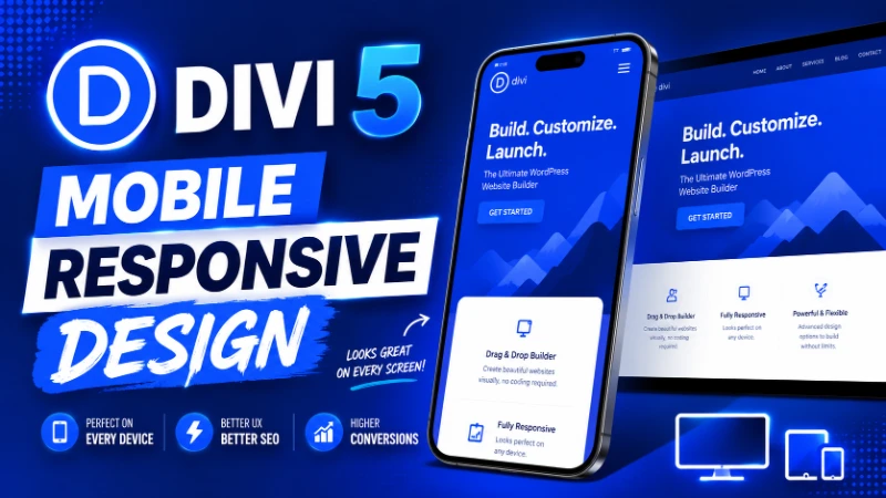
Table of Contents
Mobile traffic now makes up more than half of most website visits, and on many sites it has crossed seventy or even eighty percent. If your design does not feel right on a phone, you are losing visitors before they even see what you offer.
For Divi users, the good news is that Divi 5 makes responsive design easier than ever. The visual builder includes device-specific settings for almost every option, so you can fine-tune layouts for desktops, tablets, and phones without writing custom CSS.
In this guide, I will walk through practical techniques for building mobile responsive websites in Divi 5, based on what actually works in production projects.
Why Mobile Responsive Design Matters
A responsive website is one that adapts gracefully to different screen sizes. On a desktop monitor it feels spacious and detailed. On a phone it stays readable, scannable, and easy to navigate.
Getting this right affects:
- Search rankings, since Google uses mobile-first indexing
- Bounce rates, since users leave broken-looking sites quickly
- Conversion rates, especially for ecommerce and lead generation
- Brand perception and credibility
- Accessibility for users on slower connections
A site that only looks good on desktop is a site that performs poorly in 2026.
How Divi 5 Handles Responsive Design
Divi 5 uses a device-specific settings system. For most controls in the visual builder, you can switch between desktop, tablet, and phone views and adjust values independently for each.
This includes:
- Font sizes and line heights
- Padding and margin
- Column widths and stacking order
- Image dimensions
- Background settings
- Visibility toggles for modules
The default breakpoints are 981 pixels for tablet and 767 pixels for phone, which match most real-world devices. Divi 5 also supports custom breakpoints for designers who need finer control.
Step 1: Design Mobile First or Desktop First?
There are two common approaches to responsive design.
Desktop first means designing the full version first and then adjusting for smaller screens. This is how most Divi users naturally work, since the builder defaults to desktop view.
Mobile first means starting with the smallest screen and progressively enhancing for larger ones. This is more disciplined and often leads to cleaner final results.
In practice, hybrid approaches work well. Plan the content hierarchy mentally for mobile first, then build on desktop, and refine each breakpoint before launch.
The key is to never treat mobile as an afterthought. Check it as you build, not at the end.
Step 2: Use Device-Specific Typography
Typography that looks elegant on desktop often feels too large or too small on a phone. Divi 5 makes it easy to set different font sizes for each device.
Practical guidelines:
- Body text: 16 to 18 pixels on desktop, 15 to 16 on mobile
- Headings: scale down by roughly 25 to 35 percent on mobile
- Line height: slightly looser on mobile for readability
- Letter spacing: avoid heavy tracking on small screens
To adjust:
- Open any text or heading module
- Go to the design tab
- Click the device icon next to the font size control
- Set values for desktop, tablet, and phone independently
Spend a few extra minutes here. Typography differences make the biggest visible impact on mobile experience.
Step 3: Manage Spacing for Each Device
Padding and margin that work on desktop almost always need to be reduced for mobile. Large sections with 100 pixels of top padding feel right on a wide screen and overwhelming on a phone.
A good baseline is:
- Reduce section padding by 30 to 50 percent on mobile
- Tighten column gaps slightly
- Increase tap target sizes for buttons
- Keep at least 16 pixels of horizontal padding inside cards and modules
Divi 5 lets you set device-specific padding in every section, row, and module. Use it consistently across the site for a polished feel.
Step 4: Handle Images Responsively
Images are one of the biggest mobile pain points. They can break layouts, slow down pages, and distort important visuals.
Divi 5 introduced aspect ratio controls and image presets, which I covered in detail in our image design guide. For mobile responsive design specifically, these features help by:
- Keeping image proportions consistent across devices
- Preventing layout shifts when images load
- Allowing different focal points on different screen sizes
- Reducing cumulative layout shift, which improves Core Web Vitals
Always upload images at the right size for their largest display, then let Divi handle responsive scaling. Avoid uploading 4000 pixel wide hero images for a section that displays at 1200 pixels.
Step 5: Build Mobile-Friendly Navigation
Navigation is where many Divi sites fall apart on mobile. A header that looks clean on desktop turns into a cluttered mess on a phone if it is not designed carefully.
Best practices for mobile navigation:
- Use a hamburger menu for primary navigation
- Keep the logo visible but appropriately sized
- Include a clear call to action button if conversions matter
- Make tap targets at least 44 pixels tall
- Avoid hover-only dropdowns since phones do not have hover
The Book Leap landing page header customization tutorial walks through a clean mobile-friendly header setup if you want a practical example.
Step 6: Use Column Stacking Wisely
Divi 5 automatically stacks columns on mobile by default, but the stacking order is not always ideal.
For example, a two-column section with text on the left and an image on the right will stack with text first on mobile. Sometimes you want the image to appear first instead, especially in hero sections.
To control this:
- Open the row settings
- Go to the design tab
- Find the column reverse option for tablet or phone
- Toggle as needed
This small adjustment can dramatically improve mobile flow on landing pages and feature sections.
Step 7: Hide or Show Elements Per Device
Sometimes the cleanest mobile experience requires hiding elements that work on desktop but clutter smaller screens.
Common examples:
- Decorative background graphics
- Secondary navigation links
- Large image galleries
- Verbose paragraph blocks that work as captions on desktop
Divi 5 includes visibility toggles in every module under the advanced tab. Use them sparingly, since hiding important content from mobile users hurts SEO and accessibility.
A good rule: never hide content that affects understanding or conversion. Only hide visual flourishes.
Step 8: Test on Real Devices
Browser preview modes are useful but not perfect. Always test on real devices before launch.
Minimum testing setup:
- One iPhone, ideally a recent model
- One Android phone
- One tablet, either iPad or Android
- Multiple browsers: Safari, Chrome, and Firefox
Pay attention to:
- Touch interactions and tap targets
- Form usability and keyboard behavior
- Page load speed on cellular connections
- Scroll behavior and sticky elements
- Video and animation performance
Tools like BrowserStack help when you do not have access to specific devices, but nothing fully replaces holding the actual phone.
Step 9: Optimize Performance for Mobile
Mobile users often have slower connections and less powerful devices. Performance matters even more here than on desktop.
Quick wins include:
- Compressing images aggressively for mobile breakpoints
- Lazy loading below-the-fold content
- Reducing the number of fonts and weights
- Avoiding autoplay videos
- Caching aggressively
The new Divi 5 rendering engine already produces lighter HTML, which helps significantly. Combine that with good hosting and a caching plugin and most sites will pass Core Web Vitals comfortably.
For a complete performance walkthrough, see our Divi 5 performance guide.
Step 10: Use the Divi 5 Responsive Preview
Divi 5 includes built-in responsive preview modes that let you see your design at different breakpoints without leaving the builder.
Use this constantly while designing. Switch to tablet view and check spacing. Switch to phone view and verify text sizes. Catch issues during design rather than during testing.
This habit alone will improve your responsive design quality more than any single technique.
Common Mobile Design Mistakes to Avoid
After reviewing hundreds of Divi sites, these are the most common issues I see:
- Hero sections with massive desktop padding left unchanged for mobile
- Tiny tap targets on buttons and menu items
- Text overlay on background images that becomes unreadable on small screens
- Multi-column layouts that stack awkwardly without reordering
- Sticky headers that cover too much of the viewport on phones
- Forms with cramped fields and small submit buttons
- Modal popups that cannot be dismissed easily on mobile
Most of these are easy to fix once you spot them. The hard part is remembering to look.
Accessibility Considerations
Responsive design and accessibility overlap significantly. A well-designed mobile experience is usually a more accessible experience overall.
Key accessibility tips for Divi 5 mobile design:
- Maintain sufficient color contrast at all sizes
- Ensure all interactive elements have visible focus states
- Provide alt text for every important image
- Avoid relying on color alone to communicate information
- Make sure font sizes can be increased without breaking layouts
These habits help screen reader users, users with low vision, and users on assistive devices.
FAQ About Divi 5 Mobile Responsive Design
Is Divi 5 fully responsive by default? Most Divi 5 layouts are responsive out of the box, but you will almost always want to fine-tune typography and spacing for mobile. The visual builder makes this quick.
Can I set custom breakpoints in Divi 5? Yes. Divi 5 supports custom breakpoints, which is useful for projects with specific design system requirements or unusual target devices.
How do I preview my Divi 5 site on mobile? Use the responsive preview icons in the builder toolbar to switch between desktop, tablet, and phone views. For final verification, test on real devices.
Why does my Divi 5 site look broken only on mobile? This usually happens when padding, font sizes, or column widths were not adjusted for smaller screens. Open each section in mobile view and tune the spacing and typography.
Does responsive design affect SEO? Yes. Google uses mobile-first indexing, which means the mobile version of your site is what gets ranked. A poor mobile experience directly affects search visibility.
Final Thoughts
Mobile responsive design is no longer optional. It is the default expectation for any modern WordPress website, and the difference between a site that converts and one that does not.
Divi 5 makes the work easier with device-specific controls, aspect ratio management, and improved performance. The rest comes down to discipline: check mobile views constantly, test on real devices, and never treat phones as an afterthought.
For ready-made responsive designs, explore our premium Divi 5 layouts, or contact us if you need hands-on help making an existing site work better on mobile. Small responsive improvements often produce some of the biggest gains in user experience and conversion rates.
About the Author

MD Nurullah
MD Nurullah is a web developer and content creator at DiviFlow, focused on building modern websites and creating helpful resources for the WordPress community.